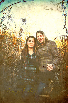
I'm always learning more and more about new software and more in Photoshop to produce cool effects to images that I call "Designer Images." There's so much you can do to produce different looks to your images. I've slowly been introducing some in my image presentations as I've been practicing using them. From aged looks, sepia with hand tinted to punched contrast and vibrancy, hi key to ones with great brush tool graphics. These effects may be applied to cards, too!
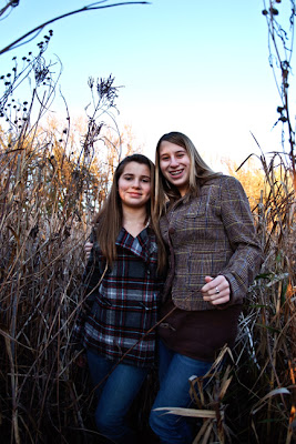
Below is the original straight out of camera...

This one shows an aged effect using a layer of old paper with some swirly brush effects.

Also, I've introduced some new
photo packages that are designed around what most my clients like and what I specialize in. As always, I can further customize them for the kind of images you want. Just ask!


1 comment:
Great photo!
Post a Comment